

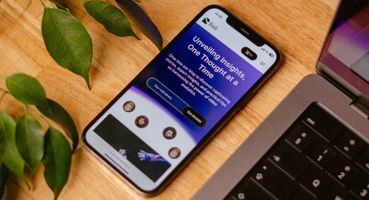
Your website is being judged on a phone first
For many small businesses, the first visit does not happen on a desktop computer anymore. It happens on a phone while someone is at work, in a parking lot, on the couch, or comparing a few options before making a decision. That means your website has to do more than simply “fit” on a smaller screen. It has to feel easy to use, quick to understand, and trustworthy right away.
A mobile-friendly website helps visitors find what they need without friction. They should be able to read your text without zooming in, tap buttons without hitting the wrong thing, and contact you without hunting through the page. If those basic tasks feel annoying, many people will leave and move on to a competitor.
This is one of the biggest reasons mobile design matters so much for small businesses. A poor mobile experience does not just look dated. It quietly costs you leads.
Mobile-friendly does not just mean responsive
A lot of people hear “mobile-friendly” and think it only means the layout shrinks down correctly. That is part of it, but it is not the whole story.
A truly mobile-friendly website also needs:
- clear, readable text
- enough spacing between links and buttons
- simple navigation
- forms that are easy to fill out on a phone
- fast load times on slower mobile connections
- page sections that stack in a logical order
In other words, mobile-friendly design is part layout, part usability, and part performance.
A site can technically be responsive and still be frustrating to use. If the text is too small, the calls to action are buried, the images load slowly, or the buttons are cramped together, the site may still turn people away.
Why it matters for small business conversions
Small business websites usually do not need to do a hundred things. They need to do a few things very well.
Most visitors are trying to answer simple questions:
- What do you do?
- Do you serve my area?
- Can I trust you?
- How do I contact you?
- Why should I choose you instead of someone else?
When your site works well on mobile, those answers are easier to find. That makes it easier for someone to call, submit a form, request a quote, or book a service.
When it does not work well on mobile, the opposite happens. People hesitate. They postpone. They leave.
That is why mobile design is not just a design preference. It has a direct effect on whether your website helps your business or just sits there.
Mobile usability also affects trust
People make quick judgments online. A clunky mobile site creates doubt even before someone reads your content.
If the spacing looks broken, the navigation feels awkward, and the page loads slowly, visitors often assume one of two things. Either the business is outdated, or it does not pay attention to details. Neither impression helps you win work.
On the other hand, a clean and smooth mobile experience sends a different message. It makes your business feel current, organized, and professional. That matters a lot when someone is choosing between several businesses that offer similar services.
Good mobile design helps the site feel credible before you ever make your sales pitch.
Google cares about mobile experience too
Your website is not only being judged by human visitors. Search engines also evaluate how well your site performs, especially on mobile.
That includes things like load speed, usability, layout stability, and general page experience. If your site is slow, bloated, or awkward on phones, that can work against you. Even if you have good services and helpful content, poor mobile performance can make it harder for your site to compete.
For small businesses, that matters because local search often starts on a phone. Someone looking for a service nearby may discover you on mobile and decide within minutes whether to keep reading or move on.
A mobile-friendly website helps you make the most of that moment.
What a strong mobile-first website usually includes
The best results usually come from starting with the mobile experience first instead of treating it like an afterthought.
That means planning the most important content and actions for small screens from the beginning. Instead of cramming a desktop layout into a phone-sized space later, the structure is built around clarity and simplicity from day one.
A strong mobile-first site often includes:
Clear messaging near the top
Visitors should quickly understand what you do, who you help, and what action to take next.
Clickable contact options
Phone numbers, forms, and contact buttons should be easy to find and easy to use.
Simple page sections
Each section should have a job. If a section does not help explain, build trust, or move someone closer to contacting you, it may not need to be there.
Lean performance
Oversized images, unnecessary scripts, and heavy page-builder code can drag down mobile performance. Keeping the site lean helps it feel faster and more polished.
Thoughtful spacing
Mobile screens are small. Good spacing makes the site feel easier to scan and interact with.
Signs your current site may not be mobile-friendly enough
If you are not sure whether your site needs work, here are a few common warning signs:
- the text feels small or crowded
- the menu is hard to use
- buttons sit too close together
- forms feel annoying on a phone
- key information is buried too far down
- the site feels slow before anything useful appears
- the layout looks fine on one device but odd on others
None of these issues seem dramatic on their own, but together they create friction. And friction is what kills conversions.
A better mobile experience usually creates better results everywhere
One of the nice side effects of good mobile design is that it improves the website as a whole. Clearer structure, simpler messaging, faster load times, and more purposeful layouts help desktop users too.
That is why mobile-first design is such a smart foundation. It forces you to focus on what matters most.
If your website communicates clearly on a phone, loads quickly, and makes it easy to take action, it is usually in much better shape overall.
Final thoughts
A mobile-friendly website is no longer a bonus feature. For most small businesses, it is the baseline.
Your site should be easy to read, easy to navigate, and easy to act on from any screen size. When that happens, visitors are more likely to stay, trust what they see, and reach out.
If your current website feels cramped, confusing, or slow on mobile, that is usually not a small problem. It is often one of the main reasons the site is underperforming.
A better mobile experience can improve usability, perception, search visibility, and lead generation all at once. That makes it one of the highest-impact upgrades a small business can make.